
In the ever-evolving world of web design, staying current with the latest trends is crucial. One design trend that has gained significant traction is glassmorphism. This sleek, modern style creates a frosted glass effect that adds depth and sophistication to your user interfaces. In this blog post, we’ll explore how to achieve this stunning effect using Tailwind CSS, a utility-first CSS framework that has revolutionized the way we style our web applications.
What is Glassmorphism?
Glassmorphism is a design trend that mimics the appearance of frosted or translucent glass. It typically involves semi-transparent backgrounds, subtle borders, and a blur effect that allows background elements to show through. This creates a sense of depth and hierarchy in your designs, making them more visually appealing and engaging.
Why Use Tailwind CSS for Glassmorphism?
Tailwind CSS is an excellent choice for implementing glassmorphism due to its utility-first approach. It provides a wide range of pre-built classes that can be easily combined to create complex styles without writing custom CSS. This makes it incredibly efficient to experiment with different glassmorphic effects and fine-tune your designs.
Creating Glassmorphic Elements with Tailwind CSS
Let’s break down the process of creating a glassmorphic element using Tailwind CSS:
- Set up the background: Start with a colorful or gradient background to make the glass effect more noticeable.
- Create the glass element: Apply a combination of Tailwind classes to achieve the glassmorphic look.
- Fine-tune the effect: Adjust the opacity, blur amount, and colors to match your design preferences.
<div class="bg-gradient-to-r from-purple-500 to-pink-500 min-h-screen flex items-center justify-center p-8">
  <div class="bg-white/30 backdrop-blur-md rounded-xl border border-white/20 shadow-lg p-6 max-w-sm">
    <h2 class="text-2xl font-bold mb-4 text-white">Glassmorphic Card</h2>
    <p class="text-white/80">This card demonstrates the glassmorphism effect using Tailwind CSS. Notice how the background slightly shows through the semi-transparent surface.</p>
  </div>
</div>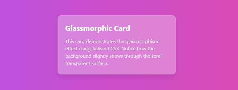
Let’s break down the classes used for the glassmorphic effect:
bg-white/30: Sets a white background with 30% opacitybackdrop-blur-md: Applies a medium blur effect to the backgroundrounded-xl: Adds rounded cornersborder border-white/20: Adds a subtle white border with 20% opacityshadow-lg: Adds a large shadow for depth
Customizing the Glassmorphic Effect
One of the strengths of using Tailwind CSS for glassmorphism is the ease of customization. Here are some ways you can adjust the effect:
- Adjust opacity: Change
bg-white/30tobg-white/20for more transparency orbg-white/40for less. - Modify blur intensity: Use
backdrop-blur-smfor a subtle blur orbackdrop-blur-xlfor a stronger effect. - Change colors: Replace
bg-white/30withbg-black/20for a darker glass effect. - Alter border style: Adjust the border opacity or remove it entirely by omitting the
borderclasses.
Advanced Techniques
To take your glassmorphic designs to the next level, consider these advanced techniques:
- Layering: Create depth by stacking multiple glassmorphic elements with varying levels of transparency and blur.
- Text contrast: Ensure readability by using contrasting text colors or adding text shadows.
- Interactive elements: Combine glassmorphism with hover effects for engaging user interactions.
<div class="bg-gradient-to-r from-blue-500 to-purple-600 min-h-screen flex items-center justify-center p-8">
  <div class="relative">
    <div class="absolute -inset-1 bg-gradient-to-r from-pink-600 to-purple-600 rounded-lg blur opacity-75 group-hover:opacity-100 transition duration-1000 group-hover:duration-200"></div>
    <div class="relative bg-black/50 backdrop-blur-md rounded-lg border border-white/20 shadow-lg p-8 max-w-md">
      <h2 class="text-3xl font-bold mb-4 text-white">Advanced Glassmorphism</h2>
      <p class="text-white/80 mb-6">This example demonstrates layering, text contrast, and interactive elements combined with glassmorphism.</p>
      <button class="bg-white/20 hover:bg-white/30 text-white font-semibold py-2 px-4 rounded-lg transition duration-300">
        Hover Me
      </button>
    </div>
  </div>
</div>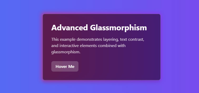
Considerations and Best Practices
While glassmorphism can create stunning visual effects, it’s important to use it judiciously:
- Accessibility: Ensure there’s sufficient contrast between text and backgrounds for readability.
- Performance: Be mindful of the performance impact of multiple blur effects, especially on lower-end devices.
- Context: Use glassmorphism where it enhances the user experience, not just for aesthetic appeal.
- Responsiveness: Test your glassmorphic designs across different screen sizes and devices.
Conclusion
Glassmorphism, when implemented thoughtfully with Tailwind CSS, can elevate your web designs to new heights of sophistication and visual appeal. By leveraging Tailwind’s utility classes, you can quickly experiment with and fine-tune your glassmorphic elements to achieve the perfect look for your project.