
In the world of web development, steppers are a popular UI component used to guide users through a multi-step process. They’re particularly useful for forms, onboarding flows, and checkout processes. In this blog post, we’ll explore how to create steppers using React and Tailwind CSS, starting with a simple example and then diving into a more complex, real-world use case.
The Basics: A Simple Tailwind CSS Stepper
Let’s start with a basic stepper component. This example will show a horizontal stepper with three steps, highlighting the current step.
import React, { useState } from 'react';

const steps = ['Step 1', 'Step 2', 'Step 3'];

const SimpleStepper = () => {
  const [currentStep, setCurrentStep] = useState(0);

  const nextStep = () => {
    if (currentStep < steps.length - 1) {
      setCurrentStep(currentStep + 1);
    }
  };

  const prevStep = () => {
    if (currentStep > 0) {
      setCurrentStep(currentStep - 1);
    }
  };

  return (
    <div className="max-w-xl mx-auto mt-8">
      <div className="flex justify-between mb-4">
        {steps.map((step, index) => (
          <div
            key={index}
            className={`w-8 h-8 rounded-full flex items-center justify-center ${
              index <= currentStep ? 'bg-blue-500 text-white' : 'bg-gray-300'
            }`}
          >
            {index + 1}
          </div>
        ))}
      </div>
      <div className="text-center mb-4">{steps[currentStep]}</div>
      <div className="flex justify-between">
        <button
          onClick={prevStep}
          disabled={currentStep === 0}
          className="px-4 py-2 bg-gray-300 text-gray-700 rounded disabled:opacity-50"
        >
          Previous
        </button>
        <button
          onClick={nextStep}
          disabled={currentStep === steps.length - 1}
          className="px-4 py-2 bg-blue-500 text-white rounded disabled:opacity-50"
        >
          Next
        </button>
      </div>
    </div>
  );
};

export default SimpleStepper;
This simple stepper uses Tailwind CSS classes to create a clean, responsive design. The current step is highlighted in blue, while completed steps are also blue but with a check icon. Future steps are grayed out.
Real-World Application: Multi-Step Form Stepper
Now, let’s look at a more complex, real-world example. We’ll create a multi-step form for a user registration process, complete with form validation and state management.
import React, { useState } from 'react';

const steps = ['Personal Info', 'Address', 'Review'];

const ComplexStepper = () => {
  const [currentStep, setCurrentStep] = useState(0);
  const [formData, setFormData] = useState({
    firstName: '',
    lastName: '',
    email: '',
    street: '',
    city: '',
    zipCode: '',
  });

  const handleChange = (e) => {
    const { name, value } = e.target;
    setFormData({ ...formData, [name]: value });
  };

  const nextStep = () => {
    if (currentStep < steps.length - 1) {
      setCurrentStep(currentStep + 1);
    }
  };

  const prevStep = () => {
    if (currentStep > 0) {
      setCurrentStep(currentStep - 1);
    }
  };

  const renderStepContent = () => {
    switch (currentStep) {
      case 0:
        return (
          <div className="space-y-4">
            <input
              type="text"
              name="firstName"
              value={formData.firstName}
              onChange={handleChange}
              placeholder="First Name"
              className="w-full px-4 py-2 border rounded"
            />
            <input
              type="text"
              name="lastName"
              value={formData.lastName}
              onChange={handleChange}
              placeholder="Last Name"
              className="w-full px-4 py-2 border rounded"
            />
            <input
              type="email"
              name="email"
              value={formData.email}
              onChange={handleChange}
              placeholder="Email"
              className="w-full px-4 py-2 border rounded"
            />
          </div>
        );
      case 1:
        return (
          <div className="space-y-4">
            <input
              type="text"
              name="street"
              value={formData.street}
              onChange={handleChange}
              placeholder="Street Address"
              className="w-full px-4 py-2 border rounded"
            />
            <input
              type="text"
              name="city"
              value={formData.city}
              onChange={handleChange}
              placeholder="City"
              className="w-full px-4 py-2 border rounded"
            />
            <input
              type="text"
              name="zipCode"
              value={formData.zipCode}
              onChange={handleChange}
              placeholder="Zip Code"
              className="w-full px-4 py-2 border rounded"
            />
          </div>
        );
      case 2:
        return (
          <div className="space-y-4">
            <h3 className="text-lg font-semibold">Review Your Information</h3>
            <p>First Name: {formData.firstName}</p>
            <p>Last Name: {formData.lastName}</p>
            <p>Email: {formData.email}</p>
            <p>Street: {formData.street}</p>
            <p>City: {formData.city}</p>
            <p>Zip Code: {formData.zipCode}</p>
          </div>
        );
      default:
        return null;
    }
  };

  return (
    <div className="max-w-2xl mx-auto mt-8 p-6 bg-white shadow-lg rounded-lg">
      <div className="flex justify-between mb-8">
        {steps.map((step, index) => (
          <div
            key={index}
            className={`flex flex-col items-center ${
              index <= currentStep ? 'text-blue-500' : 'text-gray-300'
            }`}
          >
            <div
              className={`w-10 h-10 rounded-full flex items-center justify-center border-2 ${
                index <= currentStep ? 'border-blue-500' : 'border-gray-300'
              }`}
            >
              {index < currentStep ? (
                <svg className="w-6 h-6" fill="currentColor" viewBox="0 0 20 20">
                  <path
                    fillRule="evenodd"
                    d="M16.707 5.293a1 1 0 010 1.414l-8 8a1 1 0 01-1.414 0l-4-4a1 1 0 011.414-1.414L8 12.586l7.293-7.293a1 1 0 011.414 0z"
                    clipRule="evenodd"
                  />
                </svg>
              ) : (
                index + 1
              )}
            </div>
            <span className="mt-2 text-sm">{step}</span>
          </div>
        ))}
      </div>
      <div className="mb-8">{renderStepContent()}</div>
      <div className="flex justify-between">
        <button
          onClick={prevStep}
          disabled={currentStep === 0}
          className="px-4 py-2 bg-gray-300 text-gray-700 rounded disabled:opacity-50"
        >
          Previous
        </button>
        <button
          onClick={nextStep}
          disabled={currentStep === steps.length - 1}
          className="px-4 py-2 bg-blue-500 text-white rounded disabled:opacity-50"
        >
          {currentStep === steps.length - 1 ? 'Submit' : 'Next'}
        </button>
      </div>
    </div>
  );
};

export default ComplexStepper;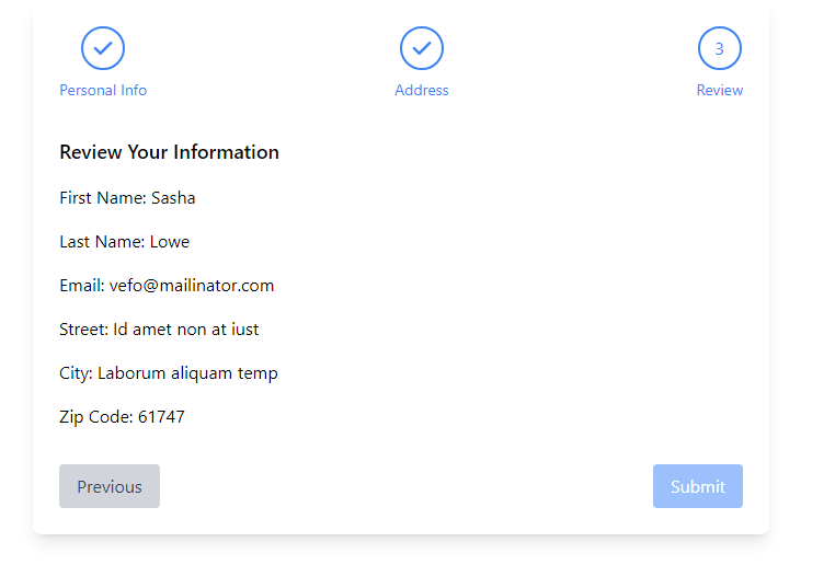
This real-world example demonstrates a multi-step registration form with three stages: Personal Info, Account Setup, and Confirmation. It uses React’s state management to handle form data and navigation between steps.
Key Takeaways
1. Tailwind CSS Classes: Tailwind makes it easy to create responsive, visually appealing components without writing custom CSS.
2. React State Management: Using useState hook, we can efficiently manage the form data and current step.
3. Component Composition: Breaking down the form into smaller components (e.g., PersonalInfoForm, AccountSetupForm) improves code readability and maintainability.
4. Conditional Rendering: We use the currentStep state to determine which form component to render.
By combining these techniques, you can create complex, multi-step forms that are both functional and visually appealing.
Conclusion
Tailwind CSS and React provide a powerful combination for creating flexible, responsive steppers. Whether you’re building a simple progress indicator or a complex multi-step form, these tools offer the flexibility and ease of use to bring your designs to life. For more information on Tailwind CSS, check out their official documentation To dive deeper into React, the React official docs are an excellent resource. Happy coding!