In today’s web design landscape, creating an engaging and user-friendly navigation experience is crucial. Full-page menus have become increasingly popular due to their ability to provide a clean, immersive interface for users to explore website content. In this blog post, we’ll explore five stunning full-page menu designs implemented using Tailwind CSS for styling and AlpineJS for interactivity. These examples will showcase different approaches to full-page navigation, each with its unique flair and functionality.
TaskMaster – Freemium SaaS Tailwind CSS Landing Page Template
The Classic Slide-in Sidebar
Our first example demonstrates a timeless design: the slide-in sidebar. This approach is perfect for websites that require a more traditional navigation structure while still offering a modern touch.
<!DOCTYPE html>
<html lang="en">
<head>
    <meta charset="UTF-8">
    <meta name="viewport" content="width=device-width, initial-scale=1.0">
    <title>Slide-in Sidebar Menu</title>
    <script src="https://cdn.tailwindcss.com"></script>
    <script src="https://cdnjs.cloudflare.com/ajax/libs/alpinejs/3.10.5/cdn.min.js" defer></script>
</head>
<body class="bg-gray-100">
    <div x-data="{ isOpen: false }">
        <!-- Header -->
        <header class="bg-blue-600 text-white p-4">
            <button @click="isOpen = !isOpen" class="text-2xl">☰</button>
            <h1 class="text-2xl font-bold inline-block ml-4">My Website</h1>
        </header>

        <!-- Overlay -->
        <div x-show="isOpen"
             @click="isOpen = false"
             x-transition.opacity
             class="fixed inset-0 bg-black bg-opacity-50 z-10">
        </div>

        <!-- Sidebar Menu -->
        <div x-show="isOpen"
             x-transition:enter="transition ease-out duration-300"
             x-transition:enter-start="-translate-x-full"
             x-transition:enter-end="translate-x-0"
             x-transition:leave="transition ease-in duration-300"
             x-transition:leave-start="translate-x-0"
             x-transition:leave-end="-translate-x-full"
             class="fixed top-0 left-0 w-64 h-full bg-white shadow-lg z-20">
             <nav class="text-center mt-6 space-y-4">
                <a href="#" class="block text-xl text-purple-600 hover:text-purple-800 transition duration-300">Home</a>
                <a href="#" class="block text-xl text-purple-600 hover:text-purple-800 transition duration-300">About</a>
                <a href="#" class="block text-xl text-purple-600 hover:text-purple-800 transition duration-300">Services</a>
                <a href="#" class="block text-xl text-purple-600 hover:text-purple-800 transition duration-300">Contact</a>
            </nav>
        </div>

        <!-- Main Content -->
        <main class="p-4">
            <!-- Page content -->
             Page Content
        </main>
    </div>
</body>
</html>
Full-page Menu
A full-screen overlay menu that appears when the menu icon is clicked. It uses a purple color scheme and larger text for the menu items.
<!DOCTYPE html>
<html lang="en">
<head>
    <meta charset="UTF-8">
    <meta name="viewport" content="width=device-width, initial-scale=1.0">
    <title>Full-page Menu Example</title>
    <script src="https://cdn.tailwindcss.com"></script>
    <script src="https://cdnjs.cloudflare.com/ajax/libs/alpinejs/3.10.5/cdn.min.js" defer></script>
</head>
<body class="bg-gray-100">
    <div x-data="{ isOpen: false }">
        <!-- Header -->
        <header class="bg-purple-600 text-white p-4 flex justify-between items-center">
            <h1 class="text-2xl font-bold">My Website</h1>
            <button @click="isOpen = !isOpen" class="text-2xl focus:outline-none z-50 relative">
                <span x-show="!isOpen">☰</span>
                <span x-show="isOpen" class="text-purple-600">×</span>
            </button>
        </header>

        <!-- Full-screen Overlay Menu -->
        <div x-show="isOpen"
             x-transition:enter="transition ease-out duration-300"
             x-transition:enter-start="opacity-0"
             x-transition:enter-end="opacity-100"
             x-transition:leave="transition ease-in duration-300"
             x-transition:leave-start="opacity-100"
             x-transition:leave-end="opacity-0"
             class="fixed inset-0 bg-white bg-opacity-95 flex items-center justify-center">
            <nav class="text-center">
                <a href="#" class="block py-4 text-4xl text-purple-600 hover:text-purple-800 transition duration-300">Home</a>
                <a href="#" class="block py-4 text-4xl text-purple-600 hover:text-purple-800 transition duration-300">About</a>
                <a href="#" class="block py-4 text-4xl text-purple-600 hover:text-purple-800 transition duration-300">Services</a>
                <a href="#" class="block py-4 text-4xl text-purple-600 hover:text-purple-800 transition duration-300">Contact</a>
            </nav>
        </div>

        <!-- Main Content -->
        <main class="container mx-auto mt-8 p-4">
            <h2 class="text-2xl font-bold mb-4">Welcome to our website</h2>
            <p class="mb-4">This is an example of a full-page menu using Tailwind CSS and AlpineJS.</p>
            <p>Click the menu icon in the header to open the full-screen overlay navigation.</p>
        </main>
    </div>
</body>
</html>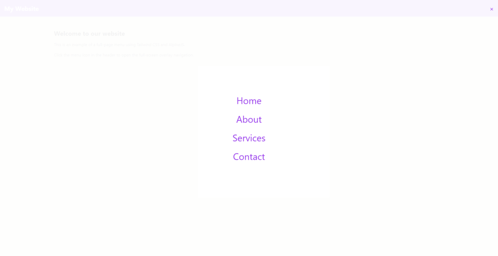
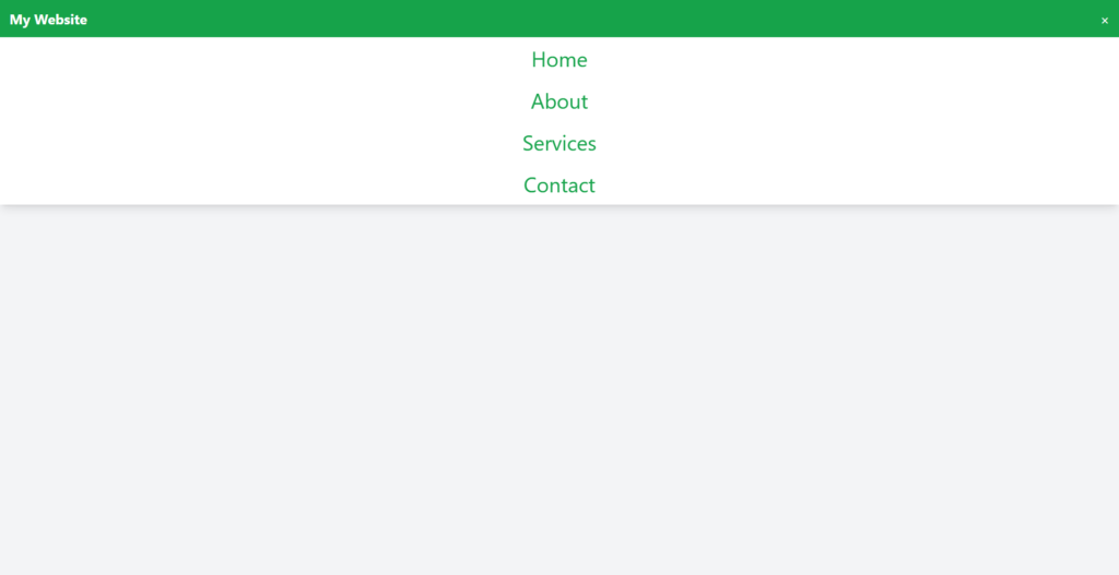
Top Dropdown Menu
For a more minimalist approach, consider the top dropdown menu. This design is excellent for websites that want to maintain a clean header while providing easy access to navigation options.
<!DOCTYPE html>
<html lang="en">
<head>
    <meta charset="UTF-8">
    <meta name="viewport" content="width=device-width, initial-scale=1.0">
    <title>Top Dropdown Menu</title>
    <script src="https://cdn.tailwindcss.com"></script>
    <script src="https://cdnjs.cloudflare.com/ajax/libs/alpinejs/3.10.5/cdn.min.js" defer></script>
</head>
<body class="bg-gray-100">
    <div x-data="{ isOpen: false }">
        <!-- Header -->
        <header class="bg-green-600 text-white p-4 flex justify-between items-center">
            <h1 class="text-2xl font-bold">My Website</h1>
            <button @click="isOpen = !isOpen" class="text-2xl focus:outline-none">
                <span x-show="!isOpen">☰</span>
                <span x-show="isOpen">×</span>
            </button>
        </header>

        <!-- Dropdown Menu -->
        <div x-show="isOpen"
             x-transition:enter="transition ease-out duration-300"
             x-transition:enter-start="-translate-y-full"
             x-transition:enter-end="translate-y-0"
             x-transition:leave="transition ease-in duration-300"
             x-transition:leave-start="translate-y-0"
             x-transition:leave-end="-translate-y-full"
             class="fixed top-16 left-0 w-full bg-white shadow-lg">
            <!-- Menu content -->
            <nav class="text-center">
                <a href="#" class="block py-4 text-4xl text-green-600 hover:text-green-800 transition duration-300">Home</a>
                <a href="#" class="block py-4 text-4xl text-green-600 hover:text-green-800 transition duration-300">About</a>
                <a href="#" class="block py-4 text-4xl text-green-600 hover:text-green-800 transition duration-300">Services</a>
                <a href="#" class="block py-4 text-4xl text-green-600 hover:text-green-800 transition duration-300">Contact</a>
            </nav>
        </div>

       <!-- Main Content -->
       <main class="container mx-auto mt-8 p-4">
        <h2 class="text-2xl font-bold mb-4">Welcome to our website</h2>
        <p class="mb-4">This is an example of a full-page menu using Tailwind CSS and AlpineJS.</p>
        <p>Click the menu icon in the header to open the full-screen overlay navigation.</p>
    </main>
    </div>
</body>
</html>