
In today’s digital landscape, user experience (UX) is paramount. One small but significant feature that can greatly improve UX is the ability to toggle password visibility. This blog post will guide you through implementing a show/hide password feature using Tailwind CSS, demonstrating examples with both Alpine.js and vanilla JavaScript.
Why Implement a Show/Hide Password Feature?
Before diving into the implementation, let’s briefly discuss why this feature is beneficial:
- Improved User Experience: Users can verify their input without the frustration of retyping.
- Reduced Error Rates: Visible passwords allow users to catch typos, leading to fewer login failures.
- Enhanced Accessibility: Some users, particularly those with visual impairments, may find it easier to read plain text.
Setting Up the Environment
For both implementations, we’ll use Tailwind CSS for styling. If you’re new to Tailwind, check out their official documentation to get started.
To quickly set up Tailwind in your project, you can use their CDN:
<script src="https://cdn.tailwindcss.com"></script>However, for production, it’s recommended to install Tailwind as a dependency and use a build process. You can learn more about this in the Tailwind CSS installation guide.
Implementation 1: Using Alpine.js
Alpine.js is a lightweight JavaScript framework that’s perfect for adding interactivity to your HTML. It works seamlessly with Tailwind CSS, making it an excellent choice for this feature.
<!DOCTYPE html>
<html lang="en">
<head>
    <meta charset="UTF-8">
    <meta name="viewport" content="width=device-width, initial-scale=1.0">
    <title>Password Toggle - Alpine.js</title>
    <script src="https://cdn.tailwindcss.com"></script>
    <script src="https://cdn.jsdelivr.net/npm/[email protected]/dist/cdn.min.js"></script>
</head>
<body class="flex justify-center items-center h-screen bg-gray-100">
    <div x-data="{ showPassword: false }" class="relative">
        <input
            :type="showPassword ? 'text' : 'password'"
            class="border rounded-md px-4 py-2 pr-10"
            placeholder="Enter password"
        >
        <button
            @click="showPassword = !showPassword"
            class="absolute inset-y-0 right-0 flex items-center px-2"
        >
            <svg xmlns="http://www.w3.org/2000/svg" fill="none" viewBox="0 0 24 24" stroke-width="1.5" stroke="currentColor" class="w-5 h-5" x-show="!showPassword">
                <path stroke-linecap="round" stroke-linejoin="round" d="M2.036 12.322a1.012 1.012 0 010-.639C3.423 7.51 7.36 4.5 12 4.5c4.638 0 8.573 3.007 9.963 7.178.07.207.07.431 0 .639C20.577 16.49 16.64 19.5 12 19.5c-4.638 0-8.573-3.007-9.963-7.178z" />
                <path stroke-linecap="round" stroke-linejoin="round" d="M15 12a3 3 0 11-6 0 3 3 0 016 0z" />
            </svg>
            <svg xmlns="http://www.w3.org/2000/svg" fill="none" viewBox="0 0 24 24" stroke-width="1.5" stroke="currentColor" class="w-5 h-5" x-show="showPassword">
                <path stroke-linecap="round" stroke-linejoin="round" d="M3.98 8.223A10.477 10.477 0 001.934 12C3.226 16.338 7.244 19.5 12 19.5c.993 0 1.953-.138 2.863-.395M6.228 6.228A10.45 10.45 0 0112 4.5c4.756 0 8.773 3.162 10.065 7.498a10.523 10.523 0 01-4.293 5.774M6.228 6.228L3 3m3.228 3.228l3.65 3.65m7.894 7.894L21 21m-3.228-3.228l-3.65-3.65m0 0a3 3 0 10-4.243-4.243m4.242 4.242L9.88 9.88" />
            </svg>
        </button>
    </div>
</body>
</html>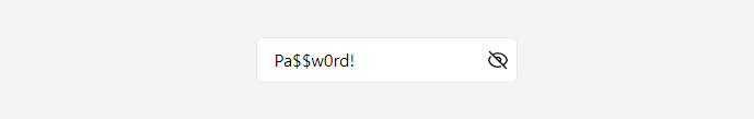
we use Alpine.js directives to manage the state:
x-datainitializes theshowPasswordstate.:typebinds the input type to theshowPasswordstate.@clicktoggles theshowPasswordstate.x-showcontrols the visibility of the eye icons based on the state.
Implementation 2: Using Vanilla JavaScript
For those who prefer not to use additional libraries, here’s how to implement the same feature with vanilla JavaScript:
<!DOCTYPE html>
<html lang="en">
<head>
    <meta charset="UTF-8">
    <meta name="viewport" content="width=device-width, initial-scale=1.0">
    <title>Password Toggle - Vanilla JS</title>
    <script src="https://cdn.tailwindcss.com"></script>
</head>
<body class="flex justify-center items-center h-screen bg-gray-100">
    <div class="relative">
        <input
            type="password"
            id="passwordInput"
            class="border rounded-md px-4 py-2 pr-10"
            placeholder="Enter password"
        >
        <button
            id="togglePassword"
            class="absolute inset-y-0 right-0 flex items-center px-2"
        >
            <svg xmlns="http://www.w3.org/2000/svg" fill="none" viewBox="0 0 24 24" stroke-width="1.5" stroke="currentColor" class="w-5 h-5" id="showPasswordIcon">
                <path stroke-linecap="round" stroke-linejoin="round" d="M2.036 12.322a1.012 1.012 0 010-.639C3.423 7.51 7.36 4.5 12 4.5c4.638 0 8.573 3.007 9.963 7.178.07.207.07.431 0 .639C20.577 16.49 16.64 19.5 12 19.5c-4.638 0-8.573-3.007-9.963-7.178z" />
                <path stroke-linecap="round" stroke-linejoin="round" d="M15 12a3 3 0 11-6 0 3 3 0 016 0z" />
            </svg>
            <svg xmlns="http://www.w3.org/2000/svg" fill="none" viewBox="0 0 24 24" stroke-width="1.5" stroke="currentColor" class="w-5 h-5 hidden" id="hidePasswordIcon">
                <path stroke-linecap="round" stroke-linejoin="round" d="M3.98 8.223A10.477 10.477 0 001.934 12C3.226 16.338 7.244 19.5 12 19.5c.993 0 1.953-.138 2.863-.395M6.228 6.228A10.45 10.45 0 0112 4.5c4.756 0 8.773 3.162 10.065 7.498a10.523 10.523 0 01-4.293 5.774M6.228 6.228L3 3m3.228 3.228l3.65 3.65m7.894 7.894L21 21m-3.228-3.228l-3.65-3.65m0 0a3 3 0 10-4.243-4.243m4.242 4.242L9.88 9.88" />
            </svg>
        </button>
    </div>

    <script>
        const passwordInput = document.getElementById('passwordInput');
        const togglePassword = document.getElementById('togglePassword');
        const showPasswordIcon = document.getElementById('showPasswordIcon');
        const hidePasswordIcon = document.getElementById('hidePasswordIcon');

        togglePassword.addEventListener('click', function () {
            const type = passwordInput.getAttribute('type') === 'password' ? 'text' : 'password';
            passwordInput.setAttribute('type', type);

            showPasswordIcon.classList.toggle('hidden');
            hidePasswordIcon.classList.toggle('hidden');
        });
    </script>
</body>
</html>
In this version, we use JavaScript to:
- Select the necessary DOM elements.
- Add a click event listener to the toggle button.
- Change the input type and toggle the visibility of the icons.
Styling with Tailwind CSS
Both implementations use Tailwind CSS for styling. Here are some key classes used:
flex justify-center items-center h-screen: Centers the content vertically and horizontally.relativeandabsolute: Position the toggle button within the input.border rounded-md px-4 py-2: Style the input field.inset-y-0 right-0: Position the toggle button on the right side of the input.
For a deep dive into these classes, check out the Tailwind CSS documentation.
Accessibility Considerations
While this feature can enhance usability, it’s crucial to consider accessibility:
- Ensure the toggle button has a clear focus state for keyboard navigation.
- Add appropriate aria labels to the button for screen readers.
- Consider adding a visible label to the input field.
For more on web accessibility, visit the Web Accessibility Initiative (WAI) website.
Security Implications
It’s important to note that while this feature can improve UX, it does slightly reduce security by potentially exposing the password to shoulder surfing. Always educate users about the risks and encourage them to be aware of their surroundings when using this feature.
Conclusion
Implementing a show/hide password feature is a small but impactful way to enhance your website’s user experience. Whether you choose to use Alpine.js for its simplicity or vanilla JavaScript for fewer dependencies, Tailwind CSS makes styling a breeze.
Remember, the best UX comes from a balance of usability, accessibility, and security. Always consider these factors when implementing new features.
For further reading on UX best practices, check out the Nielsen Norman Group’s articles on Password UX.